This block allows you to answer the user’s common queries easily and attractively. One parent element will act as an outermost single wrapper and can contain many inner accordion-item blocks.
How To Add The Accordion Block #
- 1.Open a page or a post, and click on the plus icon to add a new block, and look for the Accordion block. You can also search for it if it doesn’t pop up quickly for you.
- 2.By default, you’ll get two headers. You can also add extra accordion items once you’ve selected the bottom icon. You’ll see a plus icon that allows you to add more headings.
- 3.If you want to change the order of these blocks, you can just drag it up and down, where you want.

How To Configure Accordion Block #
Click on the below icon to configure parent block settings.
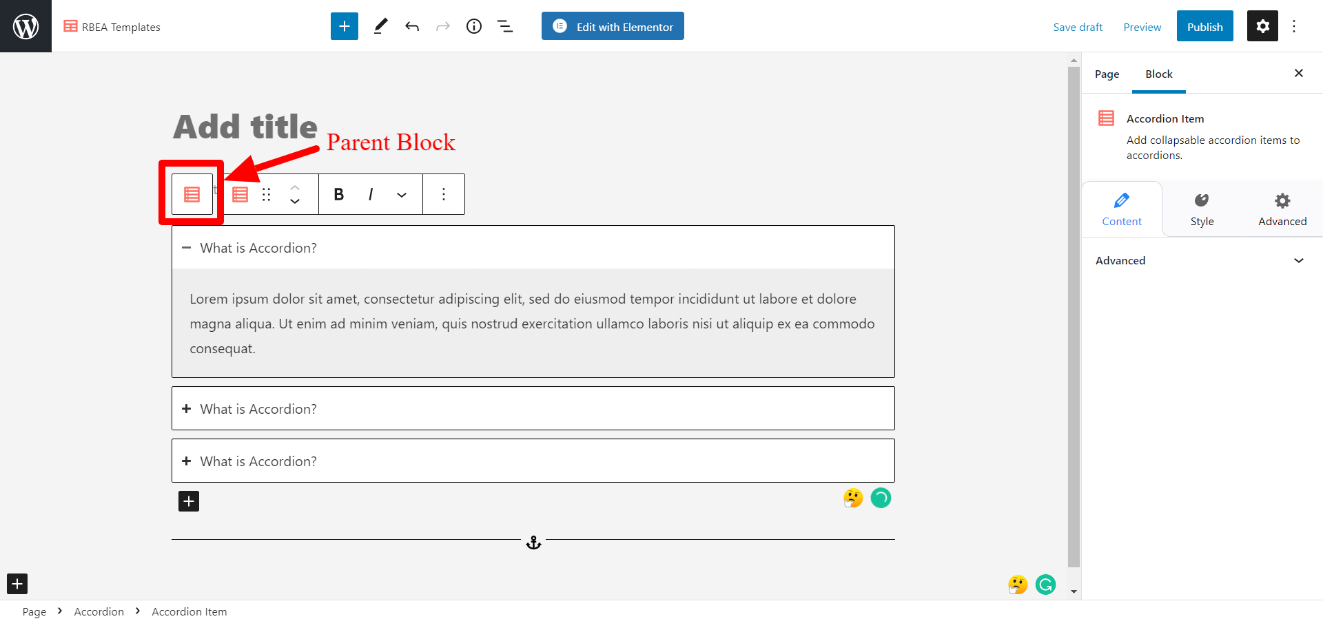
Configure Parent Block #
General #
Layout: Select Layout as Accordion or Grid.
Collapse Other Items – Enable to set accordion item to be closed by default.
Expand First Item – Enable to set the first accordion item to be open by default.

Icon #
Select ‘expand icon’ and ‘collapse icon’ from here.
Icon Alignment: You can select the alignment of the icon from here.
Icon Size – Increase or decrease the size of the icon from here.
Icon Color – Select the color of the icon separately for the active and hover element.

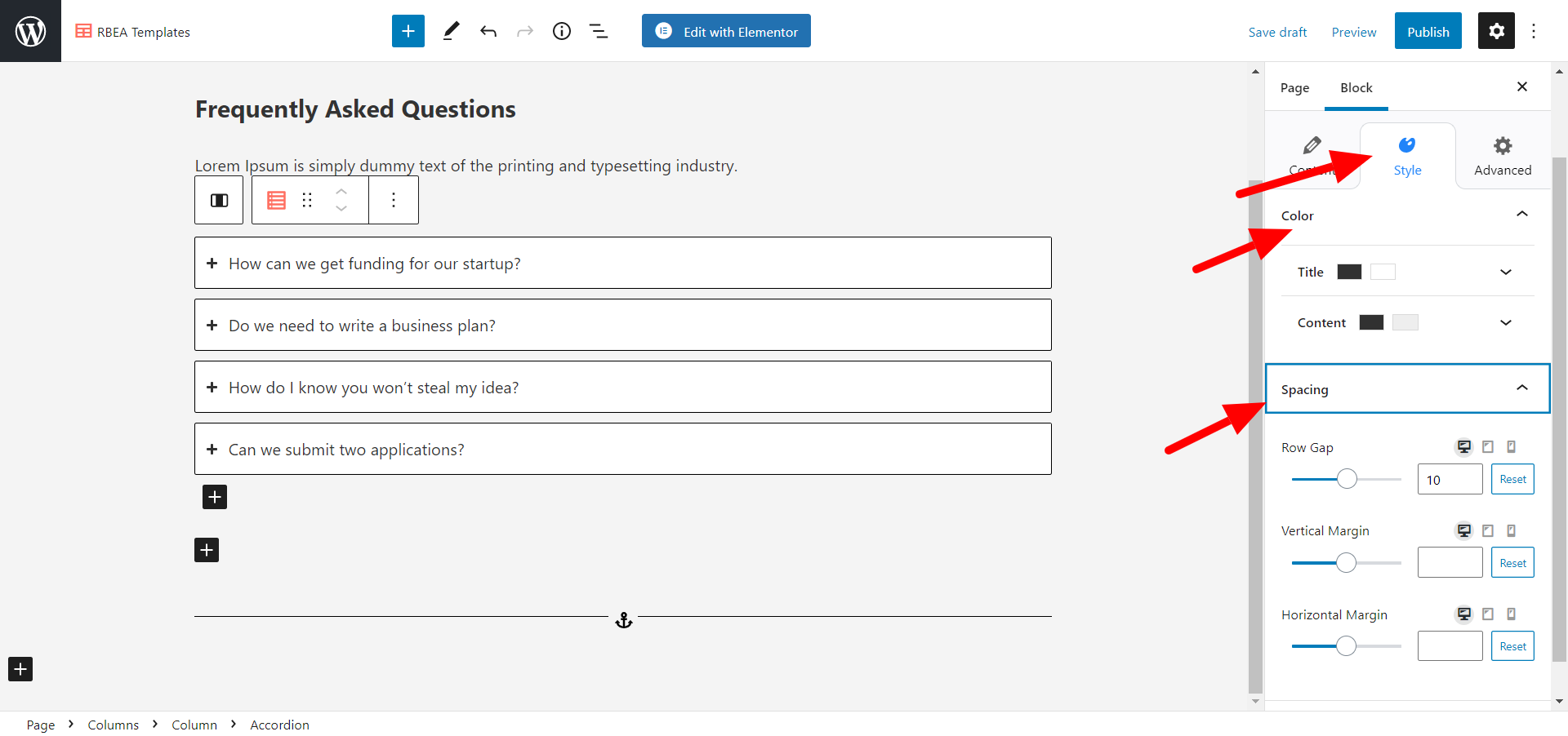
Style Parent Block #
Color #
Under the Colors tab, color options are available for Title and Content.
Spacing #
The Spacing tab offers options to customize the vertical and horizontal margin and also control the gap between rows.
Typography #
Under the Typography tab, options for font family, font size, font-weight, and line-height are available for Title and Content.

Style Child Block #
Style #
This tab comes when you select a single accordion item.
Border- The following settings are available in the border panel –
Style – You can select the style of the border as solid, dotted, rigged, double, dashed, etc. You can also choose to hide it.
Border Thickness – You can set the thickness of the border from here.
Border Radius – You can give a border radius to the block from here.
Border Color – Choose the color for the border.
Box shadow – You can give box-shadow to the block with a number of options available for customization such as color, blur, spread, position, etc.


